Cheerted Keo

“Nen Ton” based on a Khmer folktale. Images courtesy the artist.
Bio
Cheerted Keo was born in 1986 in the Khao I Dang refugee camp. At the age of 2, he went to the Netherlands with his parents. Here, he lived in a small town called Oss for 10 years. This is also where his brother and sister were born. At the age of 12, he moved to Breda, which is the biggest khmer community in the Netherlands.
Find Cheerted’s work on Behance, Instagram and his clothing store RYYSA.
Can you tell me about your background and what it was like growing up in the Netherlands as a Cambodian?
There are not a lot of Cambodians in the Netherlands, roughly 1000 people and everybody knows each other. So if something happens in a family, the whole community knows it. That’s how small it is. The community gave me a sense of “these are my people”, we share the same story, so somewhere it always felt comfortable, as home you could say.
There were always two worlds growing up: the world of the Cambodian community and the world outside of the community (school, friends, sportclubs, etc). I was always aware of both worlds growing up. I remember that my parents were always very happy if I brought a dutch friend home. They once said we want you to adapt as best as possible to the dutch culture, because we have to make the best of it.
How did you first come to illustration? I read that you wanted to be a superhero illustrator when you were a child.
Oh, drawing has always been a part of my life since childhood. It’s this thing I can do that would make the people around me happy and this made me happy. Also, my surroundings have always been very supportive and helpful to me when it comes to art, even my asian mother, haha.
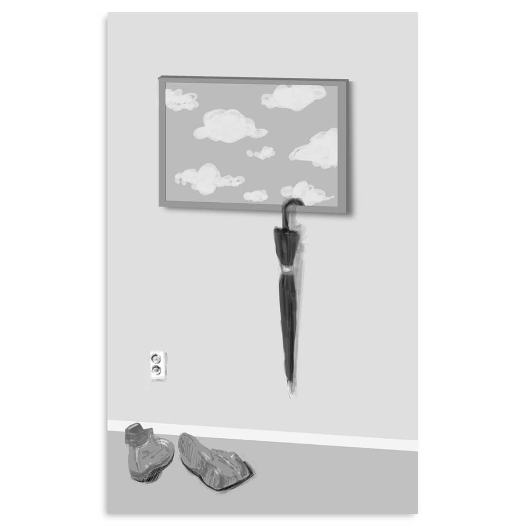

Top left: Sketch for "Umbrella” | Top right: “Slice of Thought” | Bottom: “Timetraveller”
“Style is something you can’t rush. It will develop over time.”
Who are your influences and how did you find your own style?
I love the surrealism era. Artists like René Magritte and Georgio de Chirico are my favorites. Other classic surrealists of whom I draw inspiration from are M.C. Escher, Yves Tanguy, Paul Delvaux, Giorgio Morandi. More modern day artists are Andrea Ucini, Davide Bonazzi, Jungho Lee.
Style is something you can’t rush. It will develop over time. I went to the Art Academy in the Netherlands and the mentors there helped me a lot, because I could have conversations with them about my work. These conversations helped me reflect on my work, so that I could make clearer choices for myself.
Your colour palette is very striking but pleasing to the eye, usually using only 2 or 3 colours. Why do you like working with these colours?
I wanted to challenge myself trying out colors, because my older work was only in black and white. So when it comes to colors, I’m looking for color combinations that are a little bit off. They call these disharmonious colors or dischords. I also ask myself: what do I want to tell with this piece? Do I want it to be atmospheric, or maybe draw attention to a certain area. These are examples of the questions that I ask myself when it comes down to choosing colors.

“Nen Thon” t-shirt design at RYYSA
I love the image of “Nen Ton”. What is the story about, for those who aren’t aware of the Cambodian Folktale?
Nen Ton is about an apprentice monk, who has healing powers and who has a pet crocodile. The story, in my eyes, is mainly about prejudice.
Read the full story here.
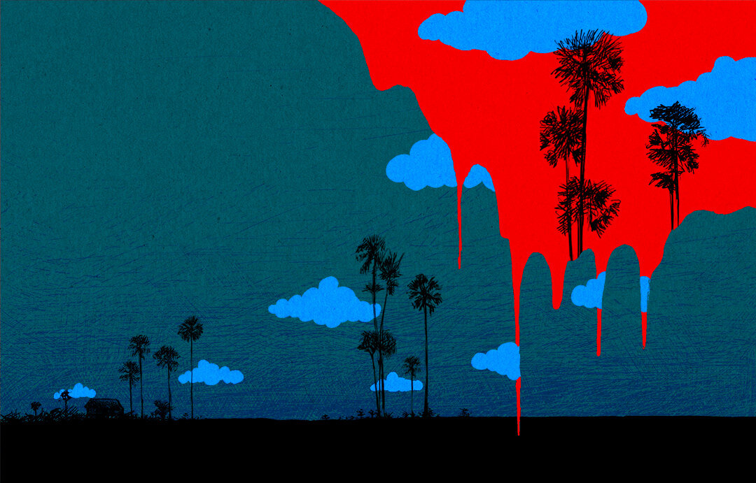
“The Sky is Bleeding”
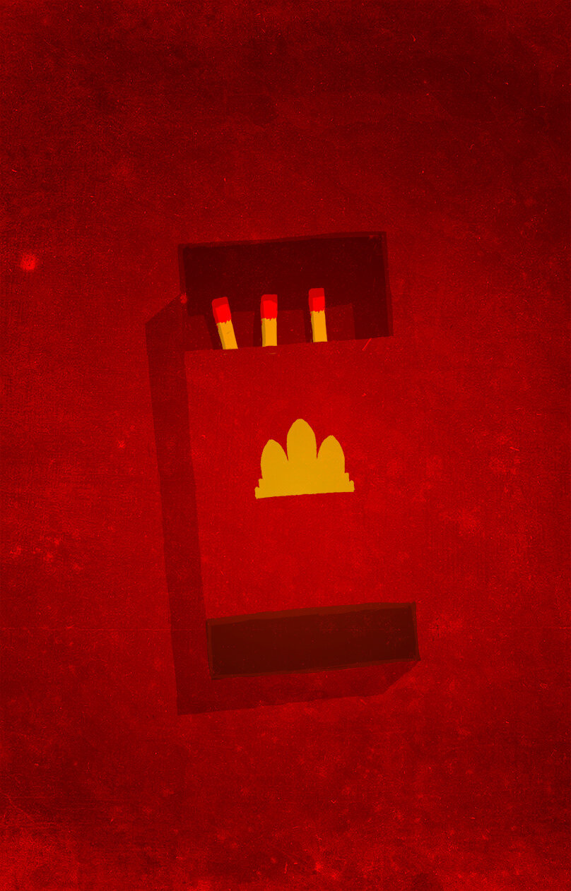
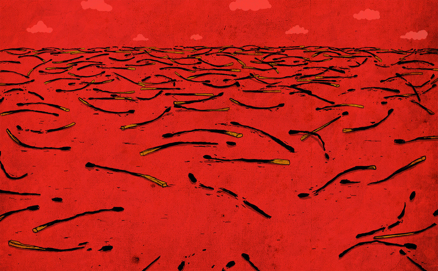
Top left: “Khmer Rouge” | Top right: “Revolution” | Bottom: "The Killing Fields”
Some of your works directly refer to Khmer history such as “Khmer Rouge”, “Revolution” and “The Killing Fields”. Through clever design it isn’t obvious from first glance but looking at them as another Cambodian person, they carry a lot of weight and meaning. Can you talk about the symbolism in these works and how you arrived at the design?
These pieces were exercises for me. I wanted to be more skillful on how to tell a story with my drawings. So by using symbols, metaphors and other semiotics, you can guide your viewer to say what you want to say. The use of red and yellow that you see refers to communism. The matches refers to people.
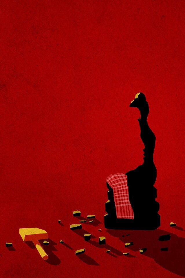
What was your thought process behind “Burried Home” which is less obvious but still conveys a sense of trauma?
Have you ever seen Stalker by Andrei Tarkovski? There’s a scene where you see a room full of sandhills. This is one of my favorite images and was the inspiration for this work.
Have you ever asked yourself, what is my definition of “Home”, what is “Sand”? What do I associate with “home” or “sand”? What do these words mean to me? What are the characteristics of “sand” or “home”? These are questions that I ask myself when I create a piece. There’s no clear answer to what this piece means, but by using these semiotics, you can guide the audience into a direction that you’d like. It’s all about communication. It leaves traces.

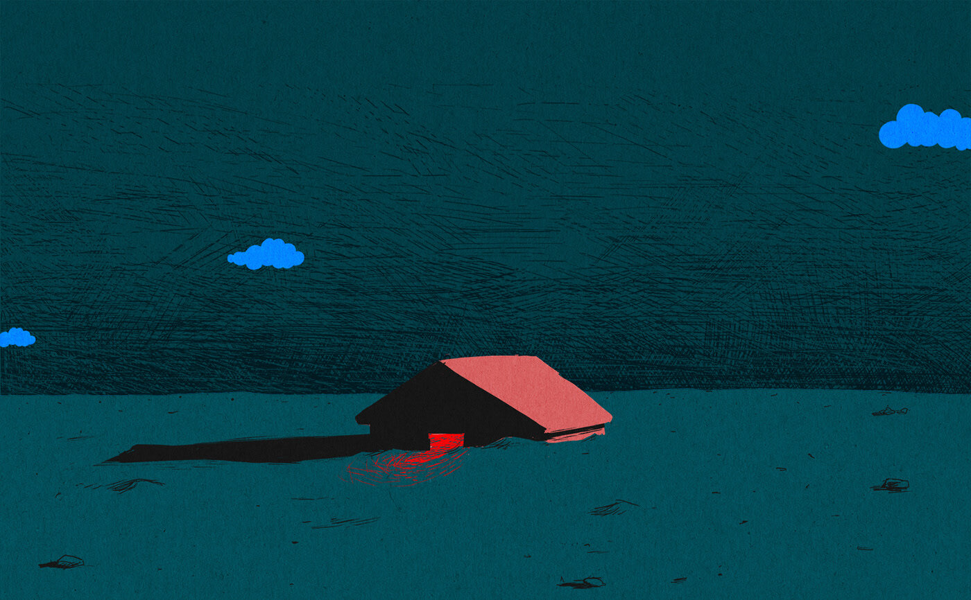
Top: “Stalker” (1979) - Andrei Tarkoski | Bottom: “Burried Home”